The challenge
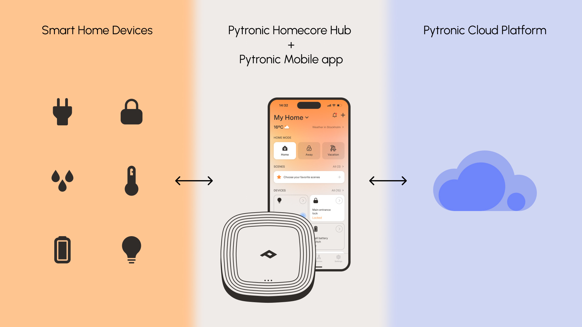
Pytronic built a proprietary smart-home hub and needed a full product, not just an app. The scope covered everything a homeowner would need: connecting devices across Zigbee, Z-Wave, and Matter, building automation scenarios, controlling devices, tracking energy usage, and managing multiple homes with shared access.
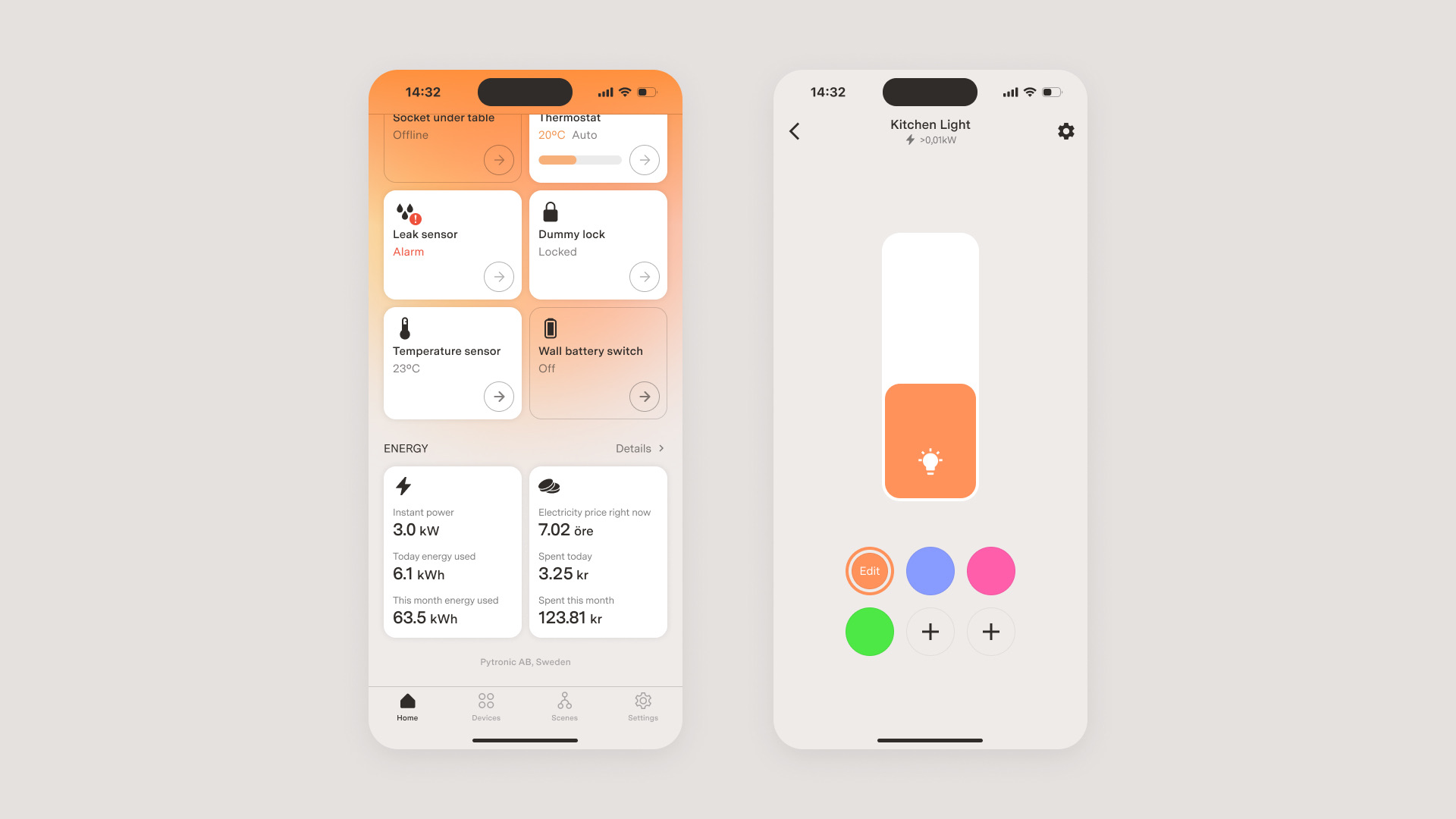
I was the only designer on the project. Requirements shifted frequently — the engineering team often didn't know what the system would support until they built it. I had to design screens and flows flexible enough to survive those changes while still feeling coherent as a product.
The approach
Starting from loose requirements, I mapped the full screen structure and added layers of functionality, styling, and UX progressively. Unfamiliar with smart-home systems at the time, I installed one at home and studied how Apple Home, Google Home, and other market leaders solved similar problems — letting me move quickly and make informed decisions from the start.
For each critical flow — hub setup, device pairing, automation builder — I built a working prototype and validated it with the team before any screens were handed off. Prototypes surfaced issues that static mockups couldn't: insufficient descriptions, step order confusion, missing error states, unclear recovery paths.

A custom atomic design library (device cards, sliders, switches, section headers) made rapid iteration possible across the entire product surface and later became the foundation for frontend development.
Automation builder (Scenes)
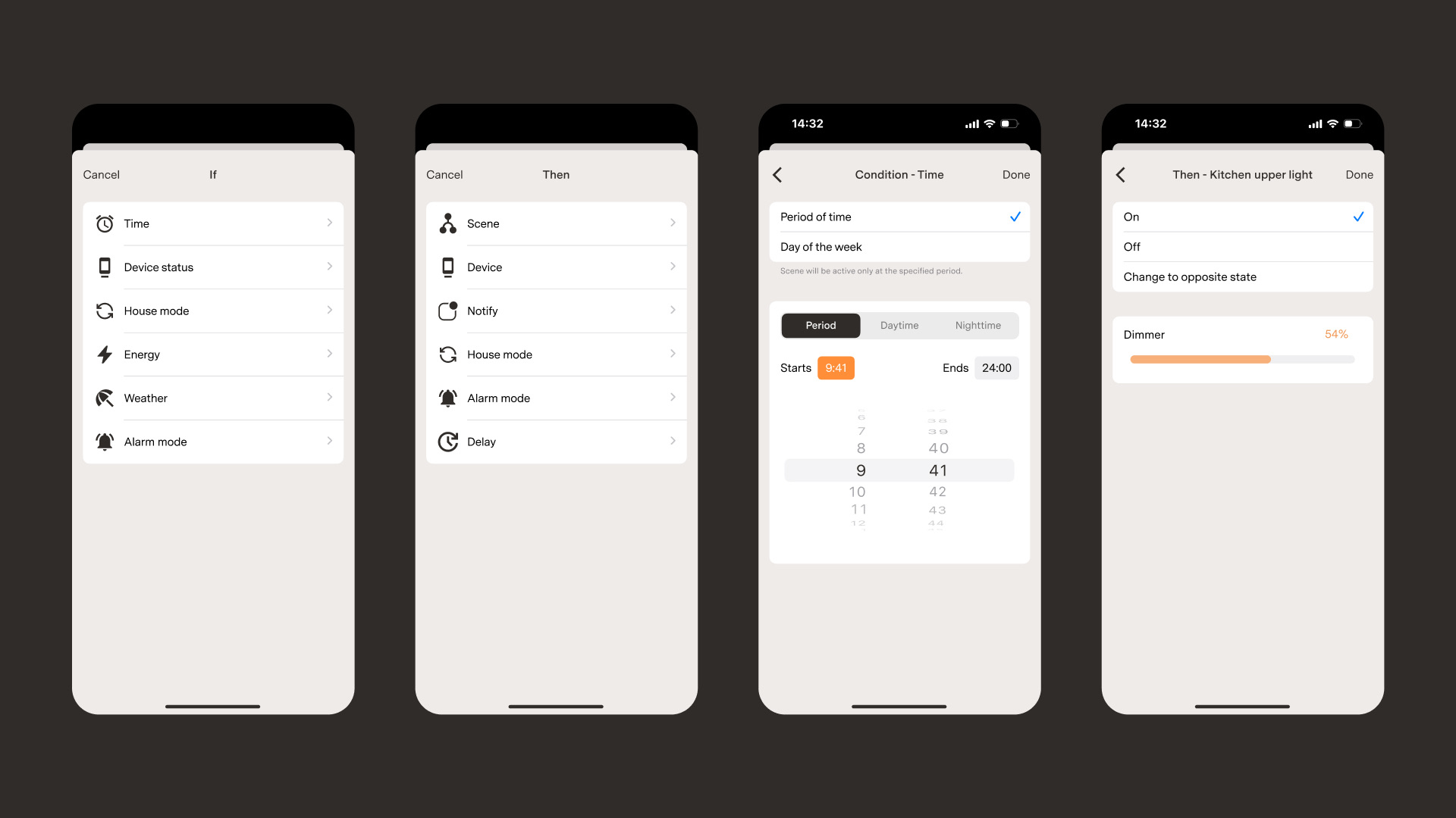
The automation system was the most logically complex part of the project. Two types of scenes: manual (launched by tapping a button in the app) and automatic (triggered when conditions are met, toggled on/off from the home screen).
Automatic scenes use a three-part structure: IF (trigger), CONDITION (must be satisfied), and THEN (actions to execute).
IF defines what fires the scene — a specific time, a device status change, a house mode change, a weather event, an energy threshold being reached, or an alarm trigger. Multiple IF statements work as OR: any one of them fires the scene.
CONDITION doesn't trigger the scene itself but must be met for the trigger to take effect. Unlike IF, conditions track a current state rather than a change — e.g., "Time is between 11 PM and 6 AM" or "House mode is Away." Multiple conditions can require all to be met or just one.
THEN actions execute sequentially, with optional delays between steps. An action can manipulate a device, trigger another pre-built scene, send a push notification or email, switch the house mode, or activate the alarm. Delays let users compose sequences — turn on lights, wait five minutes, then turn them off.
Example: IF motion sensor is triggered, CONDITION time is between 11 PM and 6 AM, THEN dim kitchen lamp to 30%.
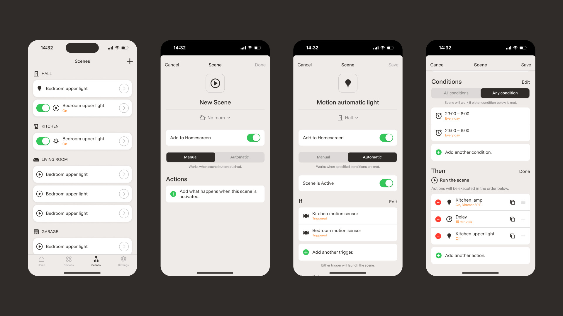
The core design challenge was that many actions and conditions weren't well-defined yet. I built the interaction framework around the structure itself — add/remove triggers, set logic operators, compose sequential actions — so the UI was testable and buildable before the full feature set was locked. As new capabilities were added on the backend, they slotted into the existing framework without requiring redesign.
Composable device controls
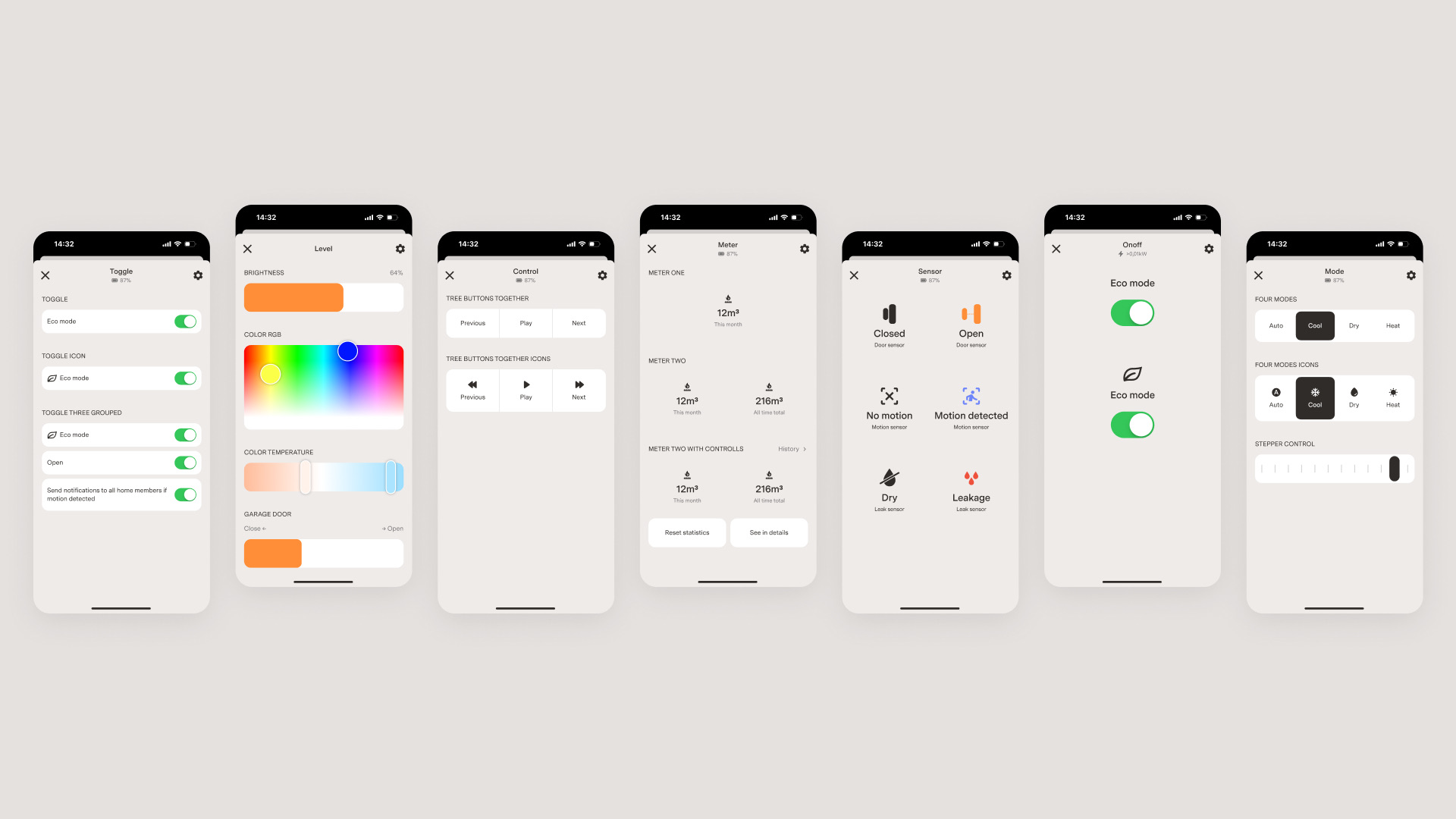
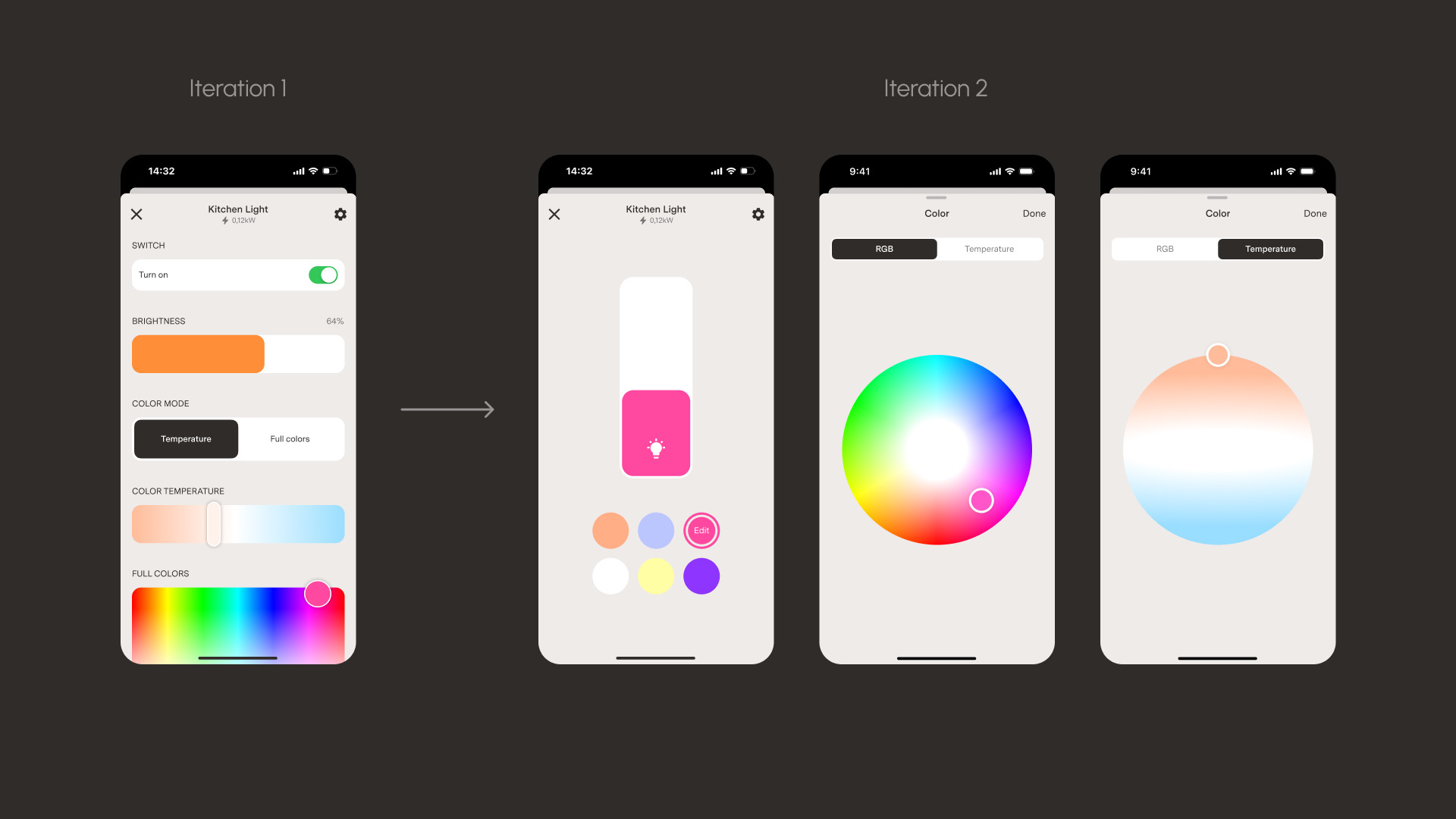
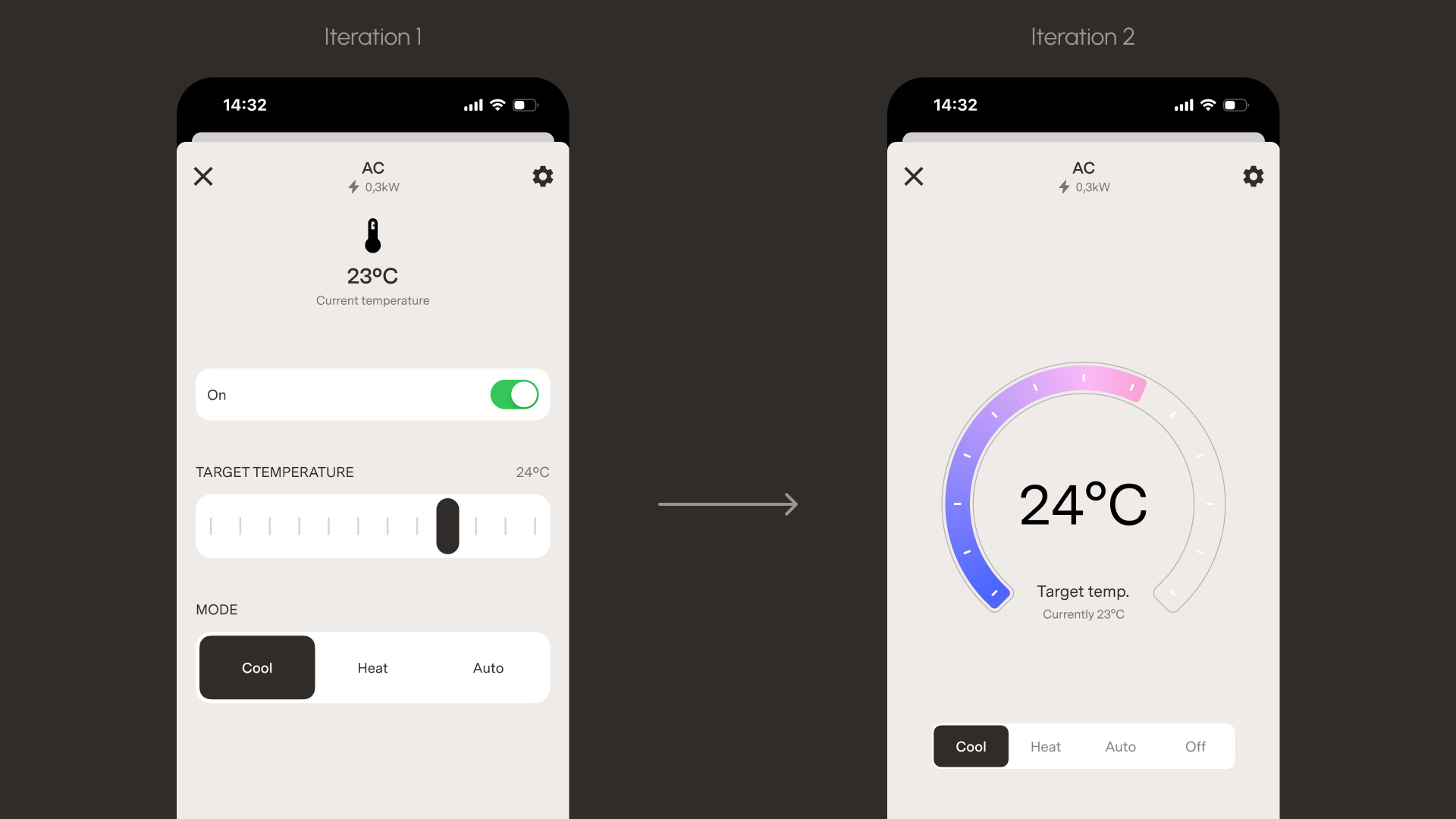
Rather than designing individual screens for each device type, I created a system of roughly a dozen composable control elements that can be assembled in any order and quantity on a device page. The combination of controls matches the capabilities of the device.
I used a reference set of device families to determine which controls the system needed: lamps, RGB lights, power metering devices, fans, motion sensors, door locks, switches, leak sensors, media players, security systems, and AC units. Each device gets the controls that match its capabilities — a lamp gets brightness and on/off; an RGB light adds color temperature and picker; an AC unit gets temperature, mode, and fan speed.
The system is extensible — the design library can support new device types and features as they are added. However, that poses a risk of clutter and confusion. To address this, I designed a future state for the device control screens that is more streamlined and focused on the most common use cases.
Energy tracking
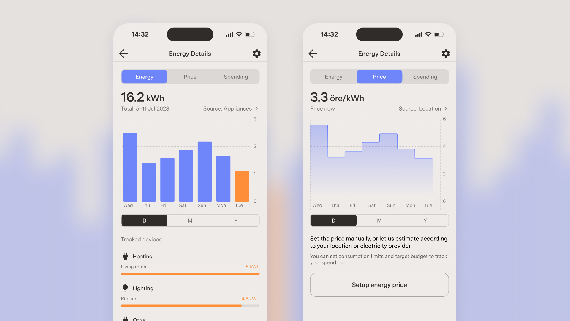
The energy section gives homeowners visibility into consumption, cost, and spending limits. I referenced Apple Health's data presentation for the visualization layer: three views covering energy usage, price per kilowatt-hour, and total spending — across daily, monthly, and yearly timeframes.
Consumption data can be pulled from a smart meter added as a device, or aggregated from individual appliances that report consumption. Users can configure their price source (manual entry, automatic by location, or provider integration), set a monthly consumption goal, and define a spending budget. These thresholds feed back into the automation system — e.g., a notification can be sent when the monthly limit is reached or the limit can be tracked as a condition to decide whether to turn on the heating systems.
Connection flows
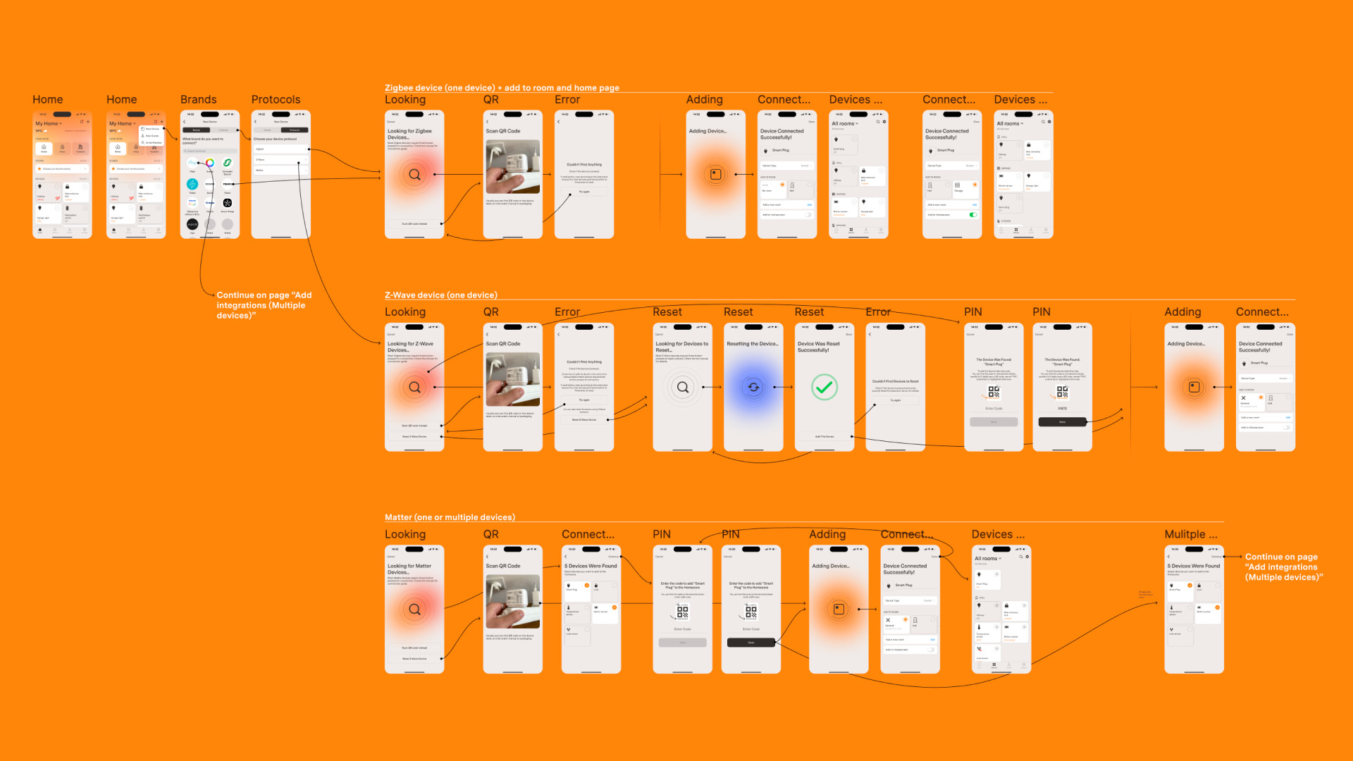
A single branching flow handled Zigbee, Z-Wave, and Matter pairing — plus bulk device addition and third-party integrations. Each protocol has different mechanics, timeouts, and failure modes, but the user sees one consistent surface: select a device, follow the steps, get confirmation.
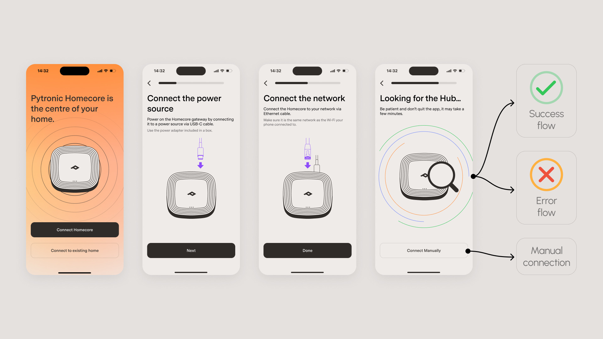
There were a lot of possible failure scenarios — most critical ones were addressed in the design (timeout, device not found, network issues, etc.). Everything else was handled with a generic error message.
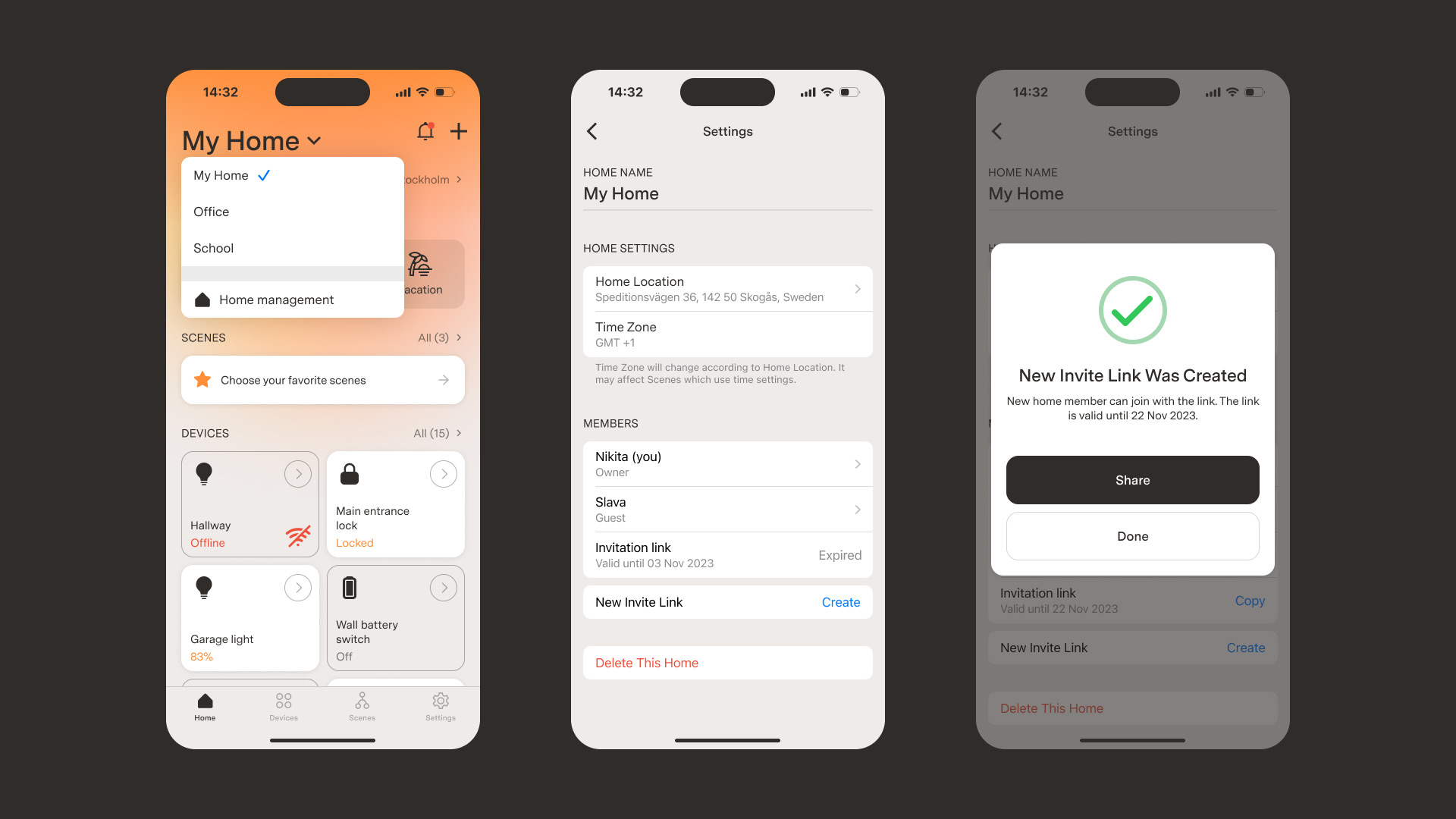
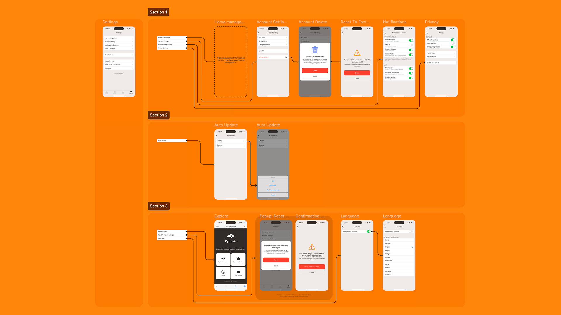
The app supports multiple locations — one user can have multiple smart-home setups, and one location can have multiple members with different access levels.
Visual details: loading states, iconography, and accessibility
Hardware pairing involves a lot of waiting (protocol timeouts, firmware responses, cloud sync). Loading screens used purposeful animation to communicate progress and reduce anxiety while the app waits for operations to complete.
For alerts and important notifications I created custom colorful icons used throughout the app for better visual hierarchy and readability.
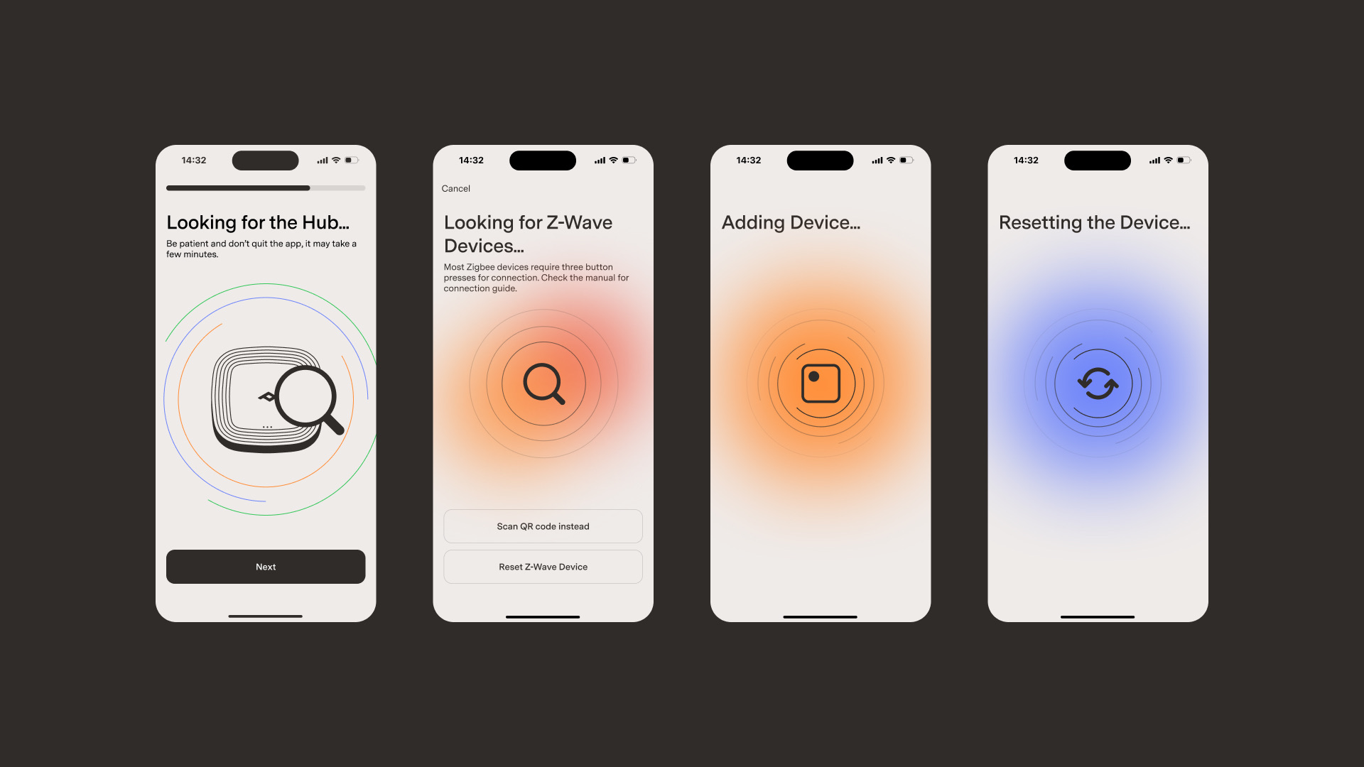
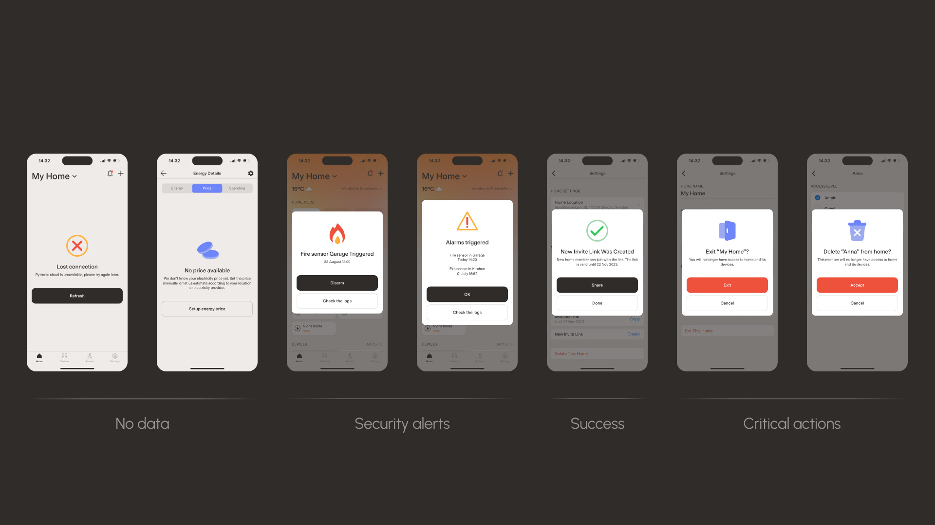
One of the client's requirements was to have an accessibility-first design. I designed the app with a high contrast color palette and a screen-reader compatible architecture. Using native iOS components helped with accessibility and also made the app feel more familiar and native.
Results and learnings
The prototypes and design system helped secure initial investment and get development started. The prototypes were the primary artifact used to align engineering on implementation priority — they made the scope tangible and gave the team a shared reference of the product vision. First installations went live; the company is still in early phases, now exploring a narrower focus on energy management.
What I would do differently next time:
- Narrow focus earlier. Scattered startup priorities are hard to design around — I'd push for a tighter scope sooner.
- Rethink the home screen default view. Devices are set up once and rarely touched — energy analytics and automation status would serve homeowners far better than device controls.